Goal
Redesign Sociopúblico’s website to reflect their expertise in institutional communication and data visualization. Balance sophistication with accessibility, catering to policymakers and NGOs while showcasing their ability to simplify complex ideas.
Design Process
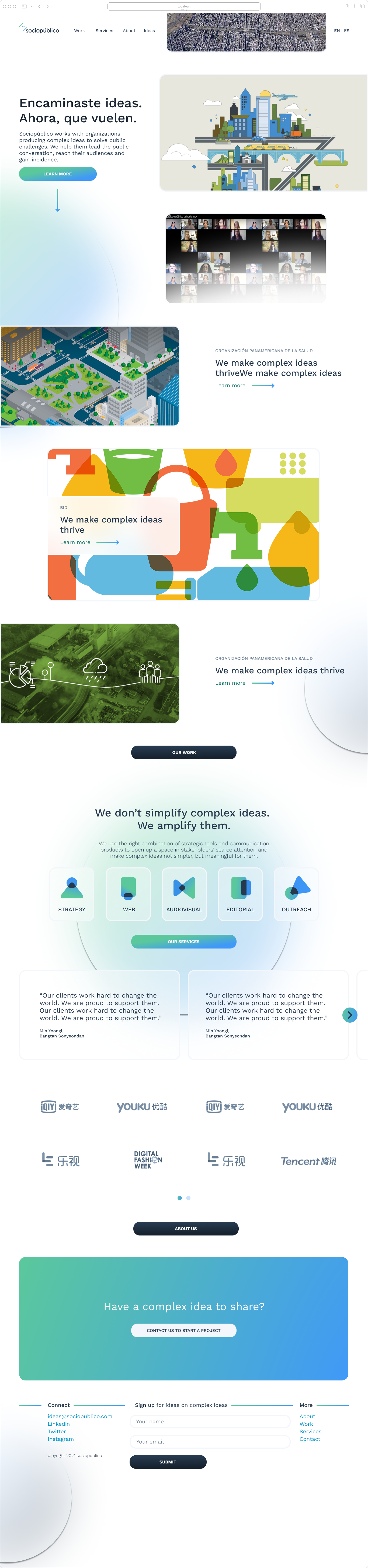
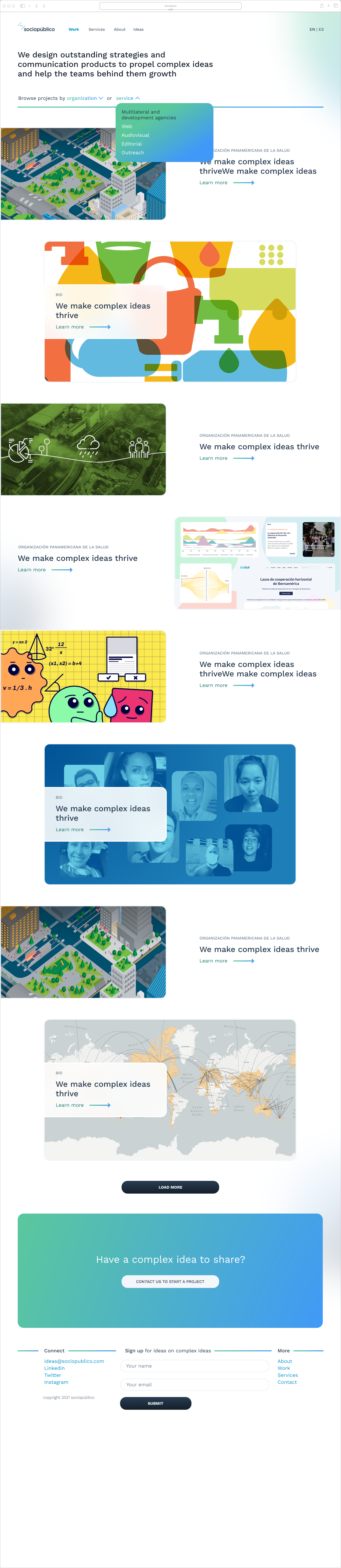
Audience-Centric Framework: Designed adaptive layouts that shift from data-dense modules for experts to storytelling flows for non-technical users.
Interactive Storytelling: Created scroll-triggered animations to guide users through case studies (e.g., “How we visualized climate policy impact for the UN”).
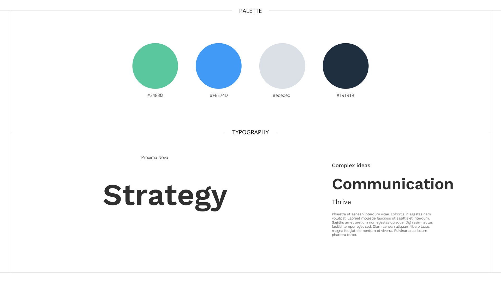
Accessibility: Ensured WCAG compliance with high-contrast palettes and keyboard-navigable data tools.
Final Result
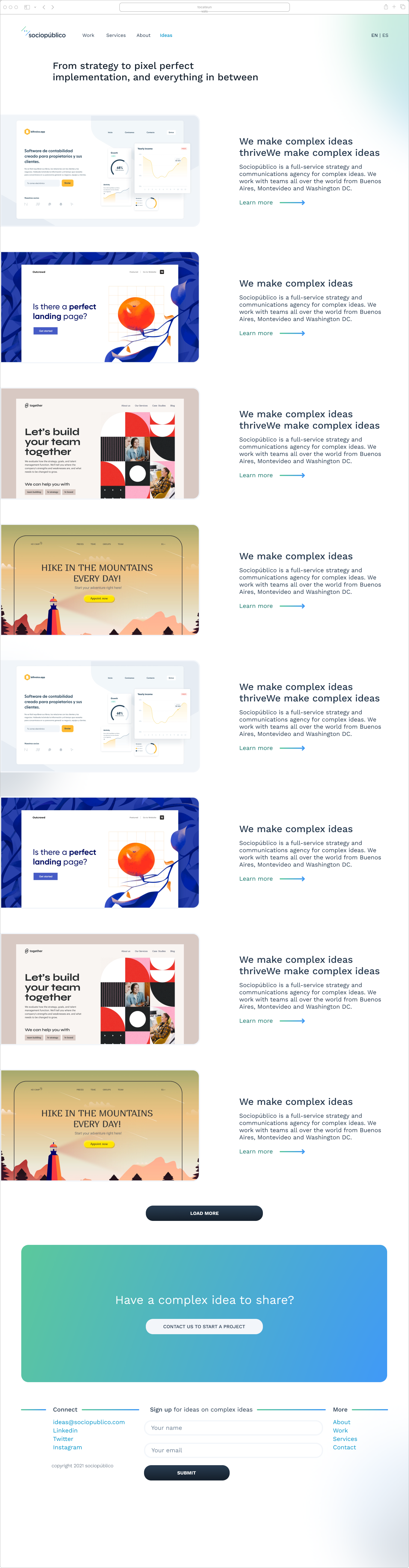
A website that acts as a portfolio and storytelling tool, featuring:
- Filterable project galleries by sector (government, nonprofits).
- Embedded data visualization templates for client demos.
- Responsive layouts tested across 10+ screen sizes.
- Embedded data visualization templates for client demos.
- Responsive layouts tested across 10+ screen sizes.
Final Thoughts
Designing Sociopúblico’s site reminded me that clarity isn’t about simplicity—it’s about creating pathways for every audience to find meaning in complexity.