The Challenge
The Assurance division of this global audit leader relied on a company-wide design system that couldn't support specialized workflows, causing design/development bottlenecks.
Our mission: create a modular framework maintaining brand alignment while addressing Assurance's unique needs. Key constraints included phased implementation to avoid disrupting active sprints and balancing technical ambition with stakeholder expectations.
The catch? We had to phase changes to avoid disrupting active product sprints, which meant balancing technical ambition with stakeholder patience.
My role
As Senior Technical Analyst, I owned system architecture and component design. Responsibilities included:
- Translating research into actionable standards
- Auditing 60+ legacy components (9 full page audits)
- Industry benchmarking (Material Design, Atlassian, IBM Carbon)
- Creating self-service documentation for designer independence
- Collaborated with 4 analysts, team lead, PM, and front-end engineers
- Auditing 60+ legacy components (9 full page audits)
- Industry benchmarking (Material Design, Atlassian, IBM Carbon)
- Creating self-service documentation for designer independence
- Collaborated with 4 analysts, team lead, PM, and front-end engineers
Research & Analysis
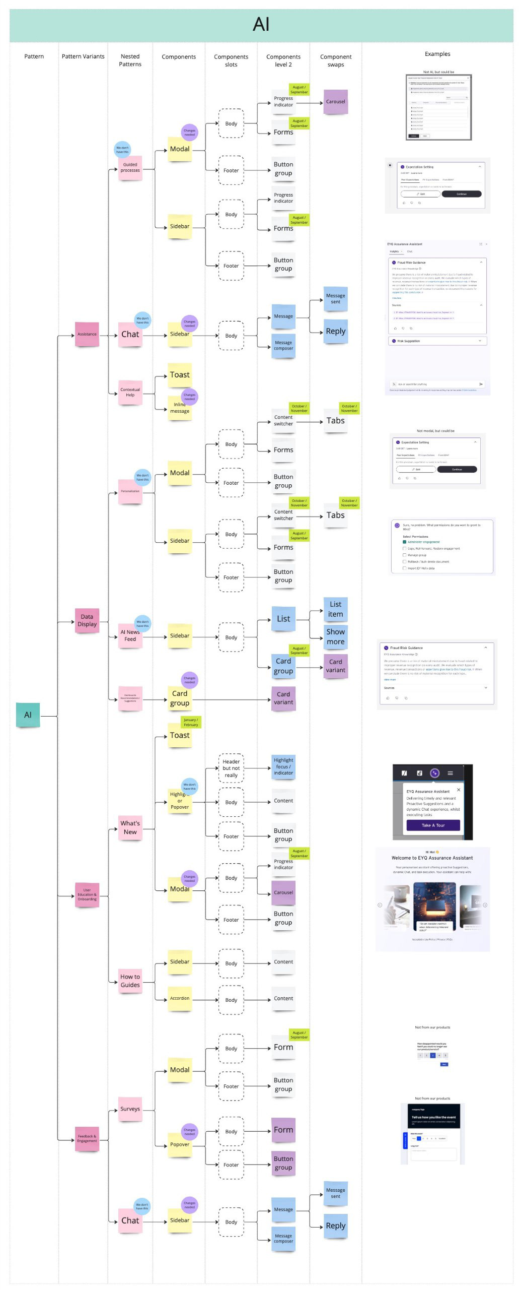
The project began with an extensive audit of our reference system. The found inconsistencies were documented and then tackled, such as redundant button variants and hard-coded color values that limited theming flexibility.
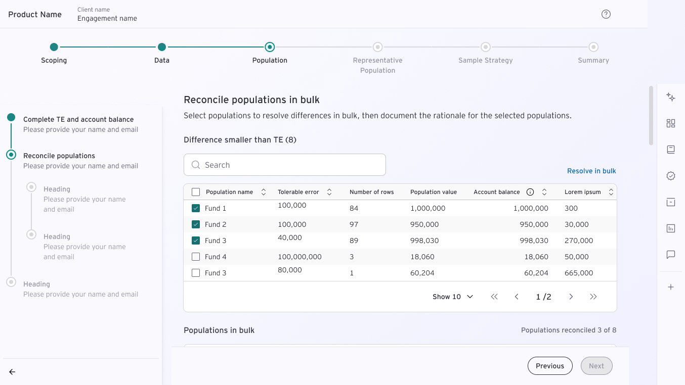
To ground decisions in proven practices, I benchmarked against industry leaders like Material Design and IBM's Carbon, comparing their approaches to components like tables and modals.
This research was distilled into diagrams and tables to help stakeholders visualize tradeoffs. These artifacts became critical tools during leadership reviews to align on scope and priorities.
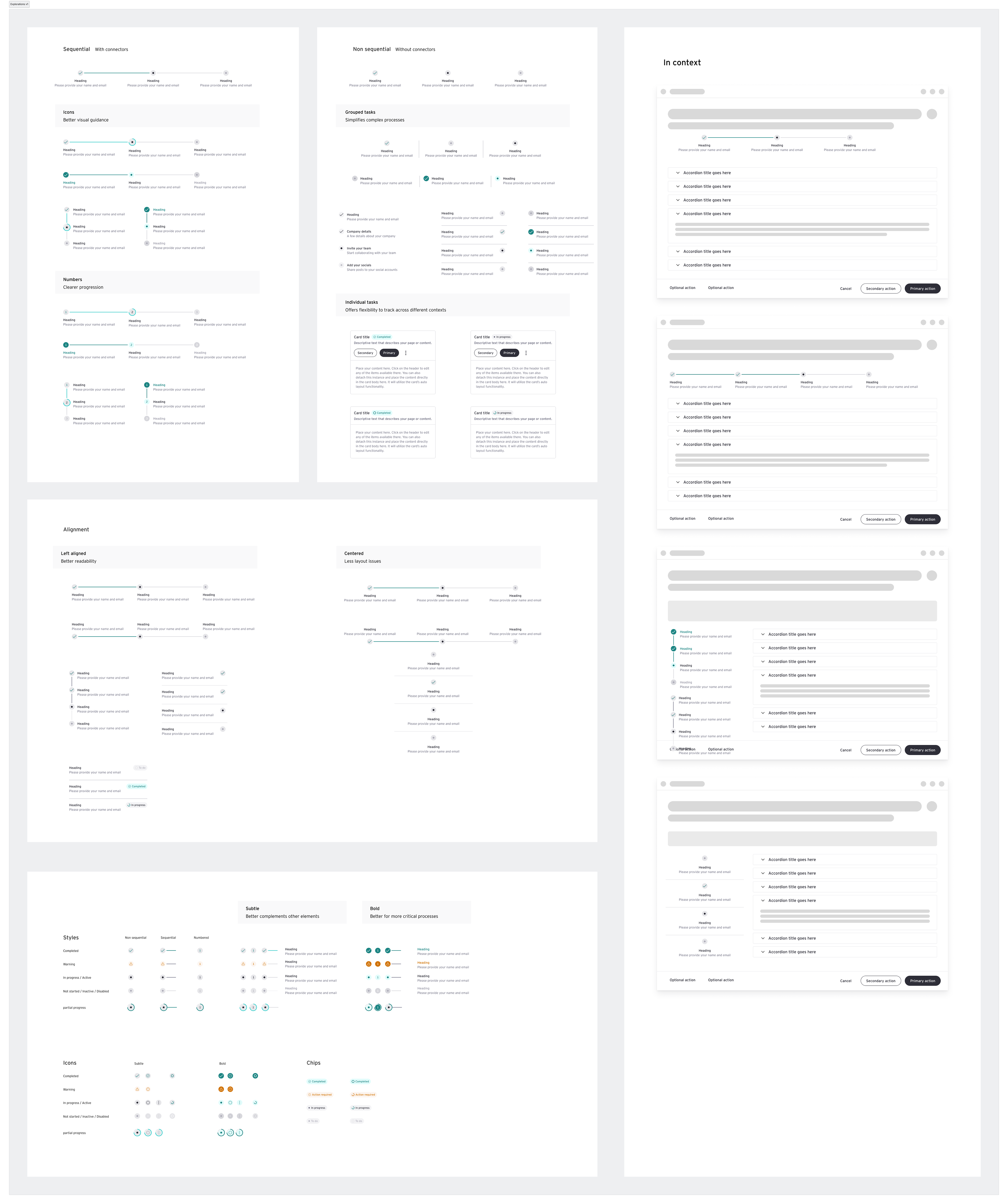
Design Process
Guided by atomic design principles, we structured the system into foundations, components, patterns, and templates. For each element, I followed the same workflow:
- Benchmarking: Create reference sheets comparing industry standards to Assurance’s needs.
- Product use cases: Worked with teams to research current and future use cases.
- Stakeholder Reviews: Present low-fidelity explorations for feedback.
- UI Design: Build high-fidelity specs using Figma, ensuring alignment with the new token system.
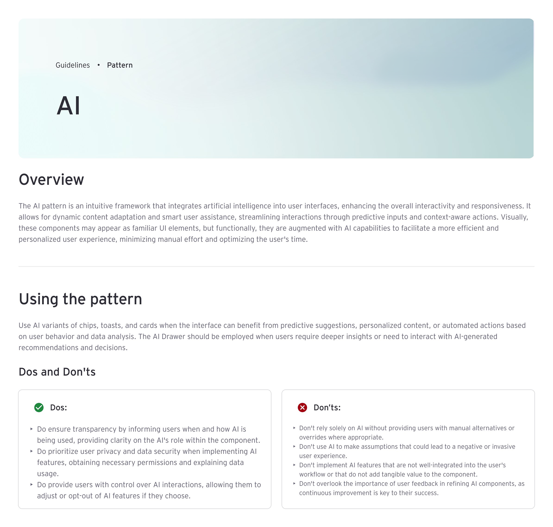
- Documentation: Write guidelines with usage rules, decision trees, and interactive examples.
- Product use cases: Worked with teams to research current and future use cases.
- Stakeholder Reviews: Present low-fidelity explorations for feedback.
- UI Design: Build high-fidelity specs using Figma, ensuring alignment with the new token system.
- Documentation: Write guidelines with usage rules, decision trees, and interactive examples.
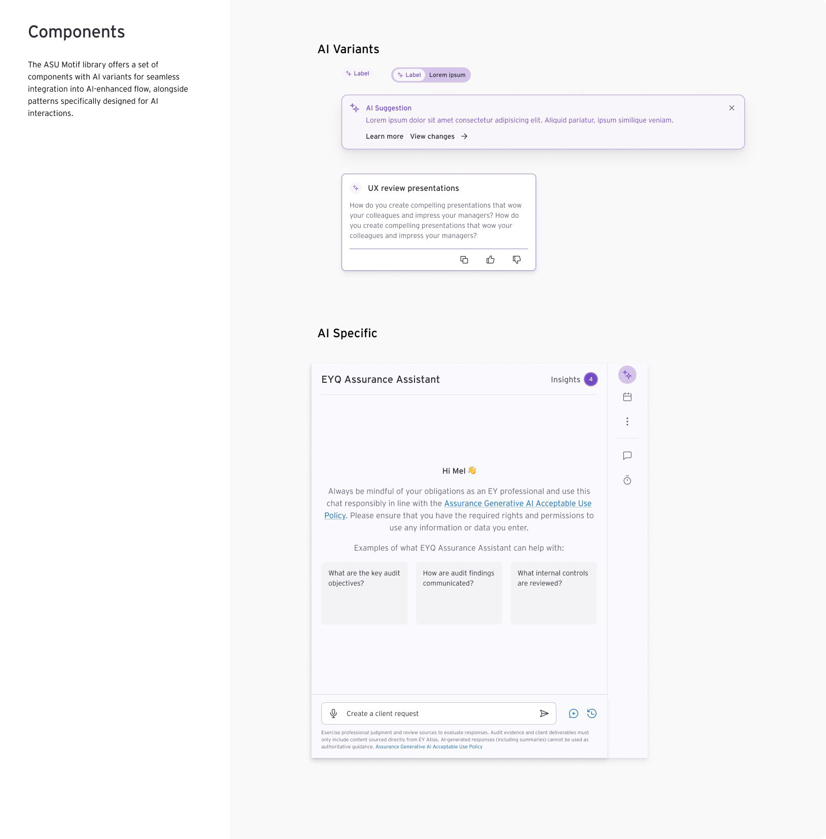
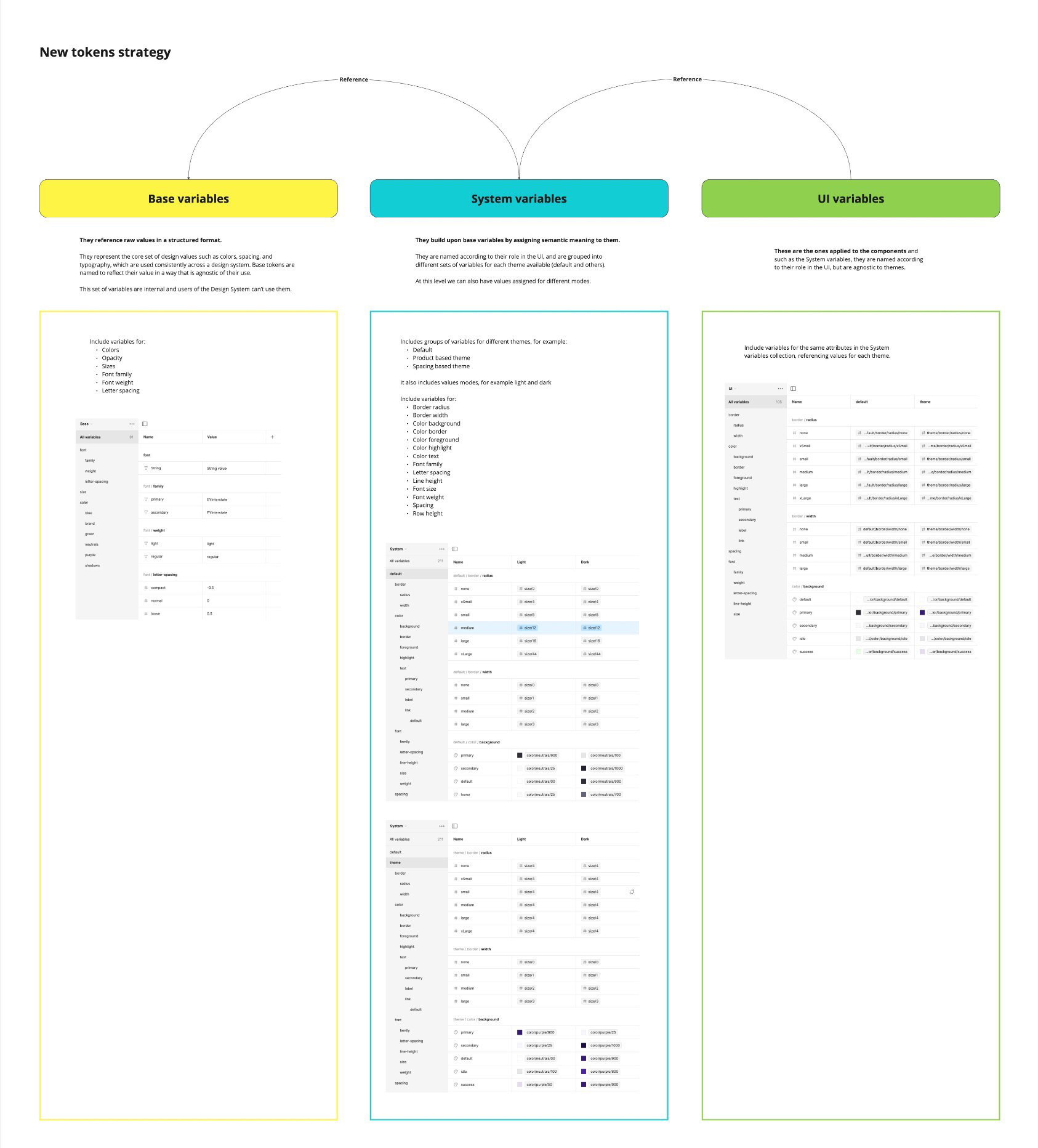
Design Token Architecture
I was responsible for defining a strategy for a modular variables architecture for styles, typography, colors, and spacing; grounded in industry best practices to ensure scalability and flexibility.
Technical feasibility was validated with developers, and strategy was tested through functional prototypes, aligning stakeholder feedback with system goals.
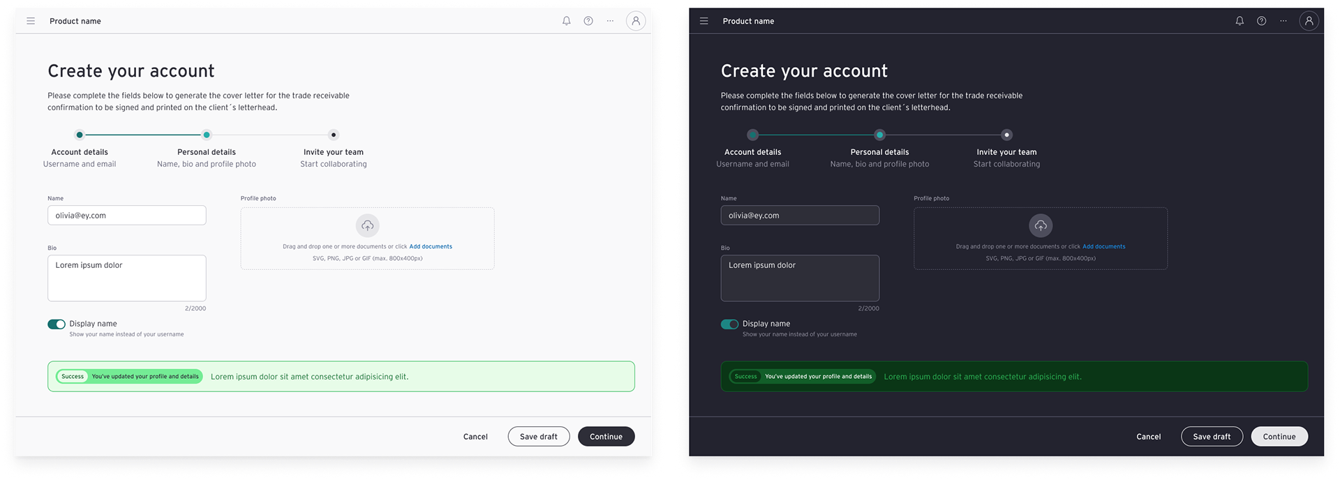
Implementation & Transition
I established foundational steps for gradual adoption, prioritizing backward compatibility to avoid disrupting existing components. Documentation outlined phased implementation paths, enabling seamless integration while preserving system stability.
Outcomes
The new system streamlined Assurance’s products design process:
- Reduced Redundancy: components were consolidated from multiple variations to just the core ones with modifiers.
- Scalable Tokens: A flexible variable structure enabled future theming.
- Adoption: Design teams quickly embraced the library, citing clearer guidelines and reusable patterns.
- Scalable Tokens: A flexible variable structure enabled future theming.
- Adoption: Design teams quickly embraced the library, citing clearer guidelines and reusable patterns.
What I Learned
- Documentation is a Product. Treating it as critical as components drove adoption.
- Tokens are a Love Language. Semantic variables facilitated communication with the engineering team.
- Tokens are a Love Language. Semantic variables facilitated communication with the engineering team.