The team
The product owner, a technical lead working as a communication focal for his team and me, playing the rol of UX researcher, UI and interaction designer.
The challenge
Making two websites that feel part of the same family while mantainting their distinctives tones.
Research and analysis
We started as usual by gathering all the quantitative information on users we could possibly have, from TV ratings, to analytics from the old website, to stats from their social media. With that, we drafted some archetypes of users so we can understand their needs in more depth.
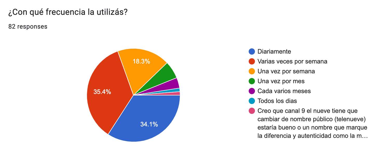
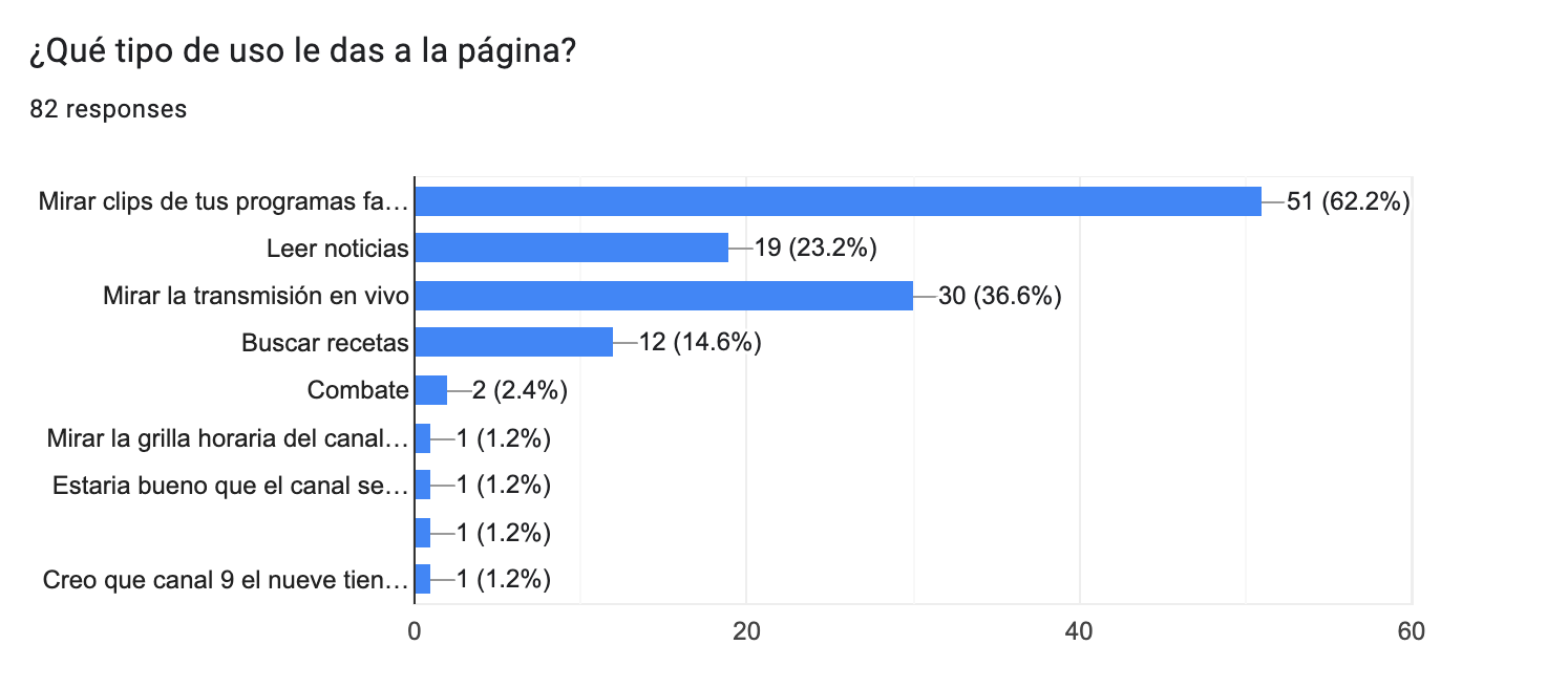
We then launched an online survey that would serve two purposes: expand on quantitative information about our users, and recruit potential subjects for user interviews and tests.
We gathered some insights on preferences and online consumption from the interviews; when it came to entertainment content, users priority was to watch reruns of their favorites shows or wanted to look for bits that had became viral in social media. On the other hand, for the news content, users usually take a moment of the day to catch up on current events, maybe in the morning or after work.That gave us a clear guide for building a new information architecture. We also decided on the KPIs we’ll use to measure our success: increase pageviews on landing pages for shows, reduce bounce rate and increase overall session time, specially on the live streaming page.
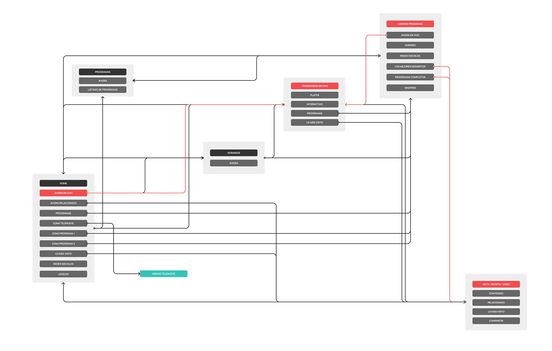
Information architecture and wireframes
Considering our users’ needs we redesigned the menu and rearranged and renamed many sections, so users could better find the content they’re looking for.
Interaction and UI design
The main choice we made for giving each website their own mood and identity, was to use contrasting color schemes, being the darker one for entertainment and the lighter for news content. We also chose a more playful and less serious typeface for entertainment.
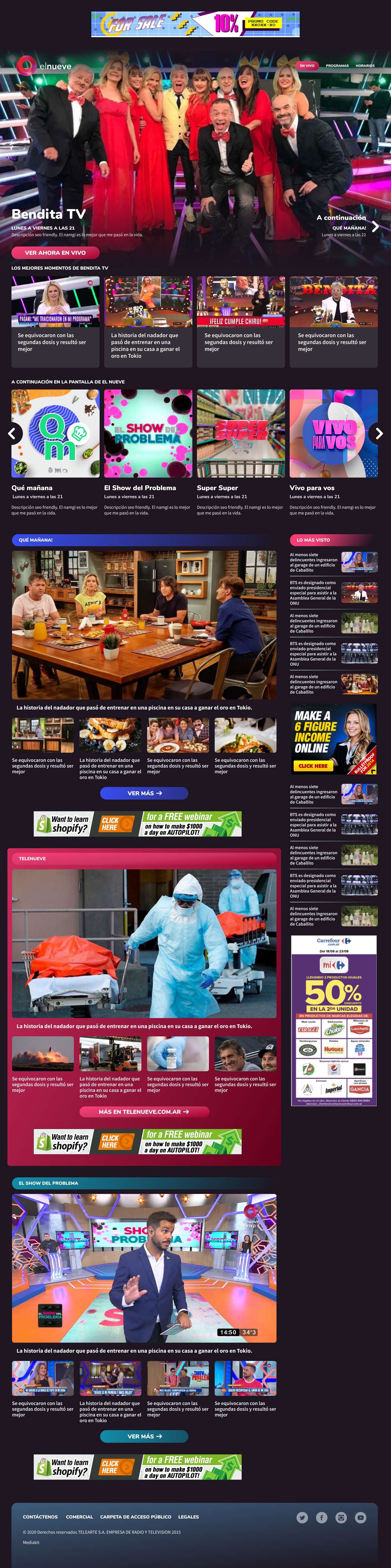
Entertainment Website
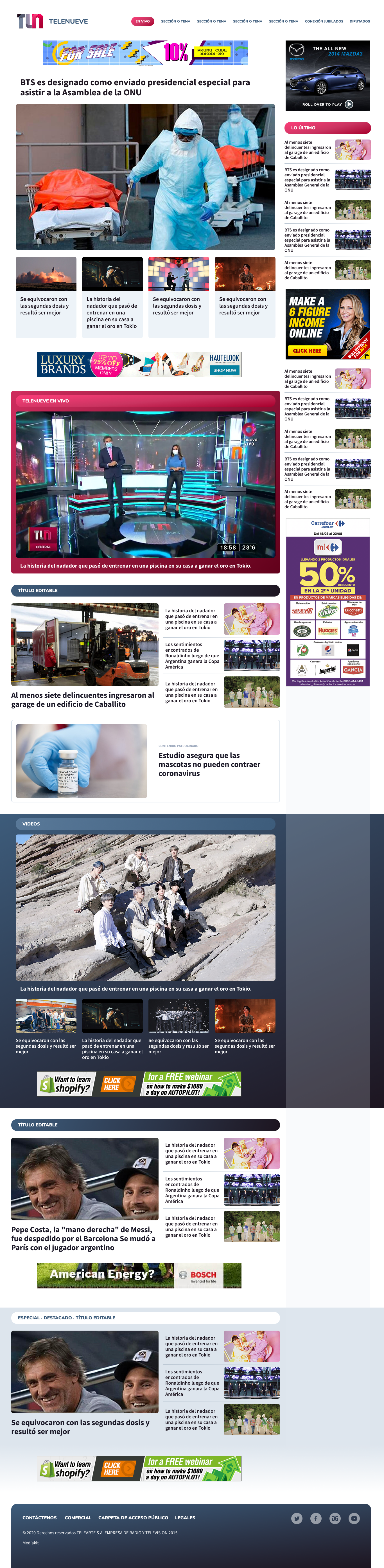
Breaking News Website
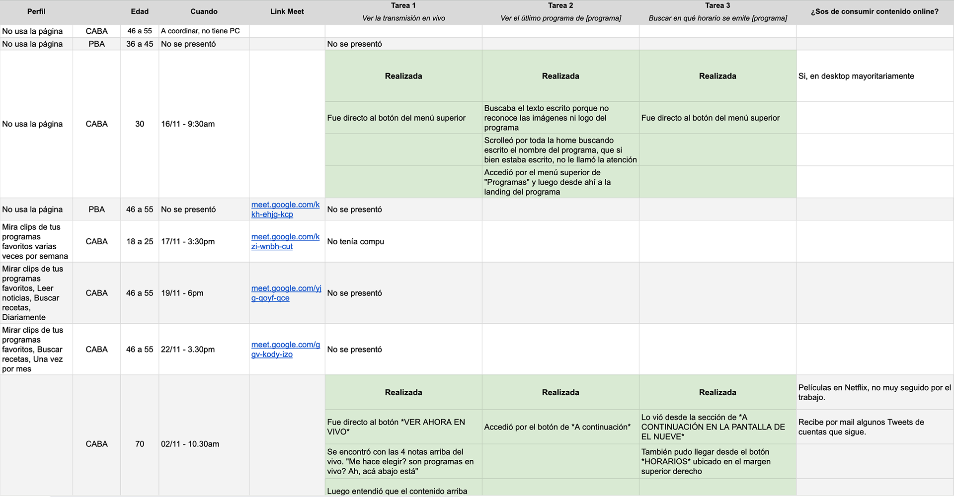
Usability tests
After validating the design with the team and the stakeholders, I built a high fidelity prototype to test with users. We found out that some sections and titles weren’t clear enough, the rest of it was pretty easy for users and they could perform the tasks we gave them without problems.
The final product and initial results
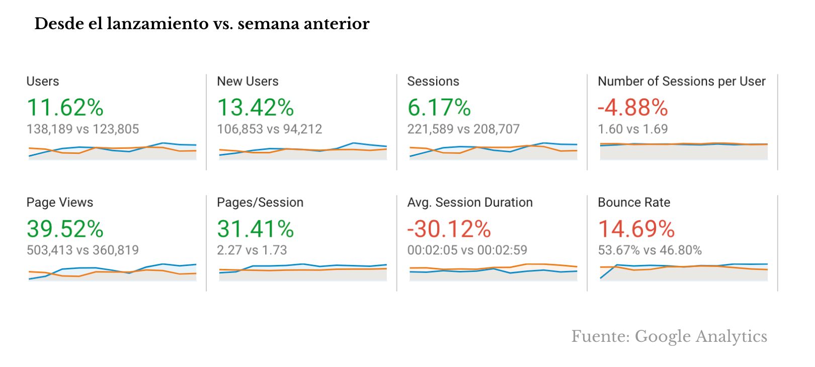
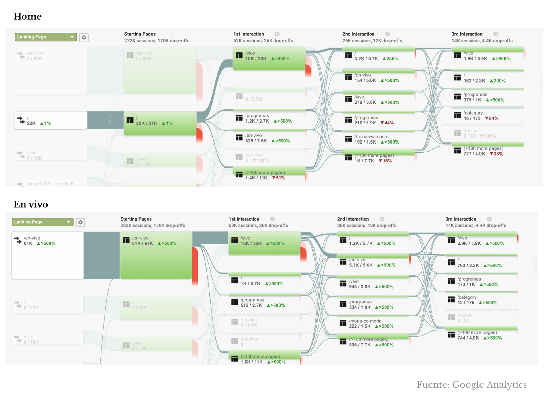
A month after launching the websites, we checked on our analytics to see how their performed according to our KPIs. Most metrics improved significantly.
What I learned
Designing with the right criteria for organizing content can make all the difference without having to add new features.