
The Challenge
Modernizing a federal government agency’s digital services requires balancing bureaucratic complexity with agile innovation. The goal was clear: simplify taxpayer access to critical tools and information while fostering cross-department collaboration—all without overhauling legacy systems or exhausting limited resources.
My Role
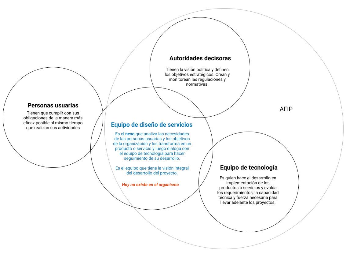
As the lead service designer, I coordinated a cross-functional effort to streamline AFIP’s digital ecosystem. My work spanned content audits, service mapping, and facilitating the agency’s first design sprint.
Collaborating with developers, a project manager, a content writer, and a UX research assistant, I bridged siloed teams to align on user-centered priorities, as well as advocating for a user centered approach.
Research & Insights
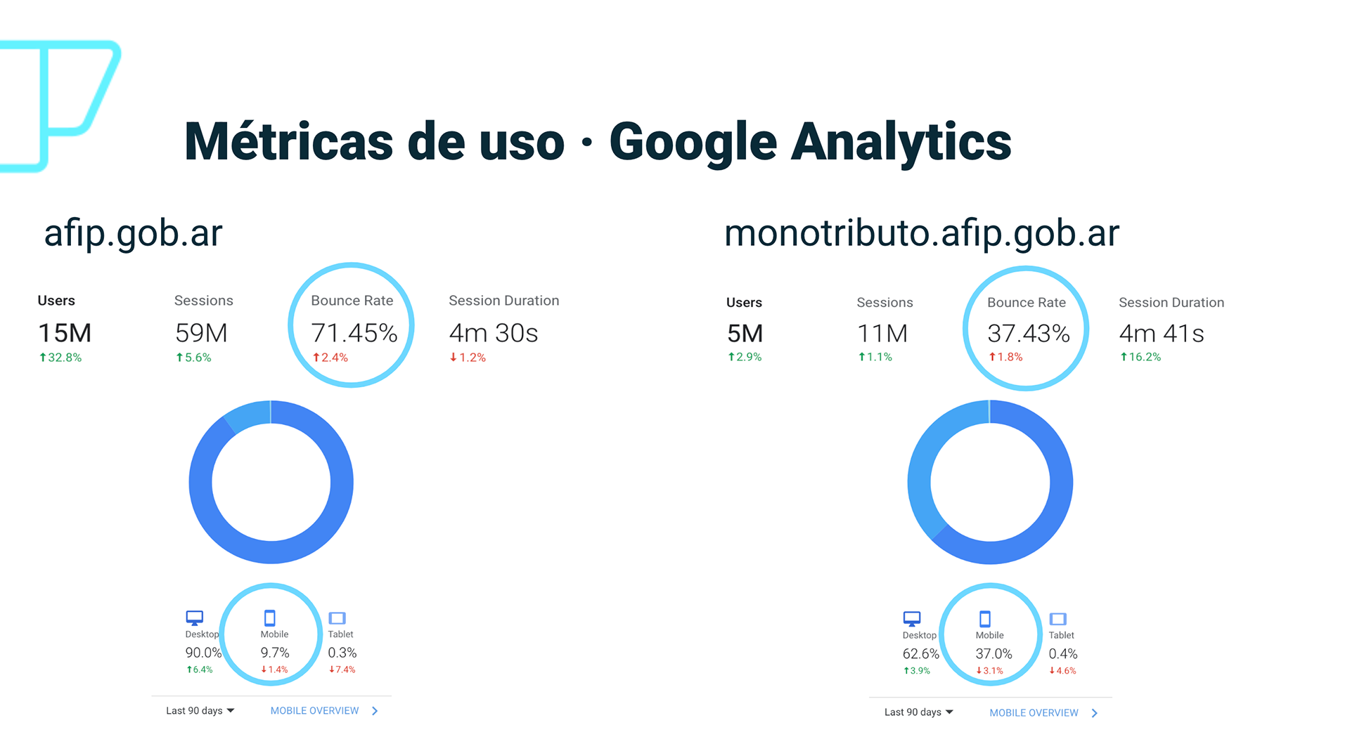
The project began with a comprehensive audit of AFIP’s website, cataloging hundreds of content pages and tools. This revealed fragmented user journeys, duplicate forms, dead-end pages, and buried services that frustrated taxpayers. To visualize the chaos, I built a sprawling information architecture diagram, which became a rallying point for stakeholders.

A diagram with all the sections and access points for the agency's website.
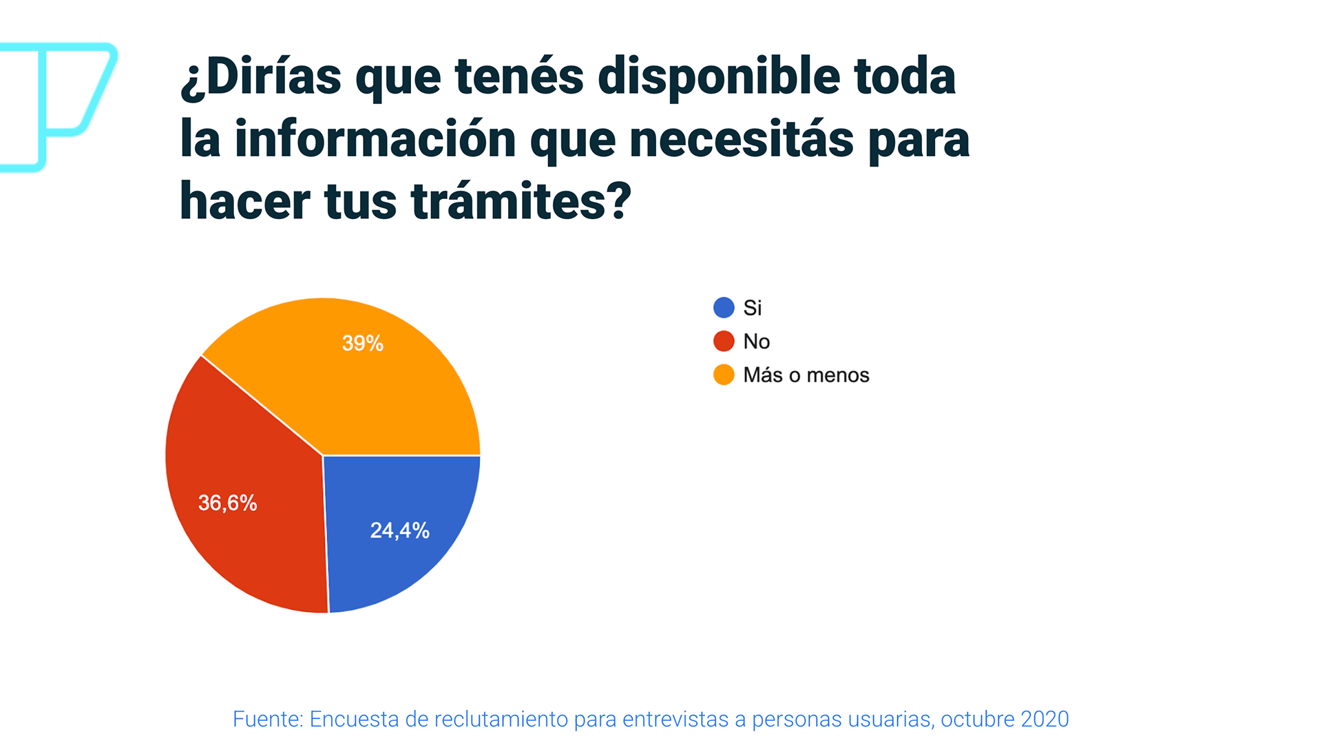
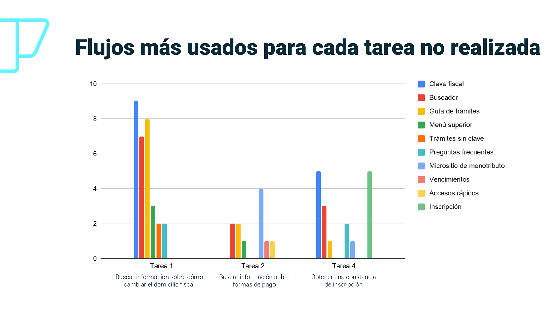
User interviews added depth to these findings. Taxpayers struggled to distinguish between similar services, while employees admitted that internal tools were siloed, slowing issue resolution. These insights framed our north star: simplify, don’t rebuild.
Design Process
With buy-in from leadership, I facilitated AFIP’s first design sprint. Cross-department teams—legal, IT, help desk—joined forces to prioritize fixes that demanded minimal resources but offered maximal user impact.
The sprint surfaced quick wins, like consolidating redundant form links and rerouting navigation paths to high-traffic services.
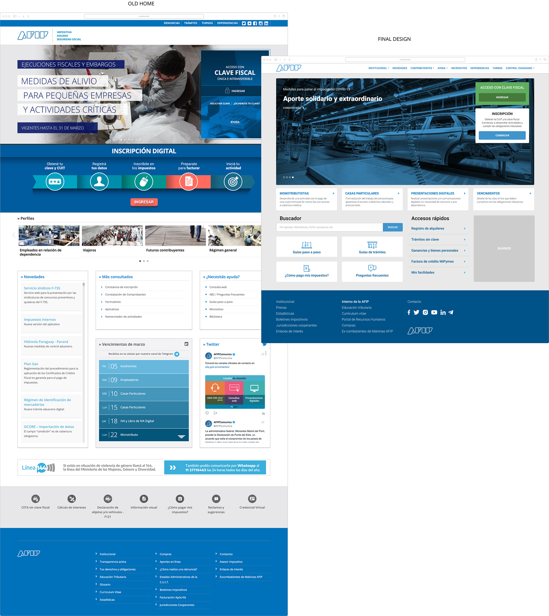
We decided to focus on the homepage and navigation redesign. Starting with low-fidelity wireframes, we proposed three alternatives:
- A dashboard-style layout for frequent services.
- A guided wizard based on taxpayer personas.
- A search-first approach with predictive text.
- A guided wizard based on taxpayer personas.
- A search-first approach with predictive text.
Stakeholder feedback favored the dashboard, but usability testing revealed taxpayers preferred a hybrid model—combining quick-access tiles with a search box. We iterated into a final prototype that grouped services by user relevance.
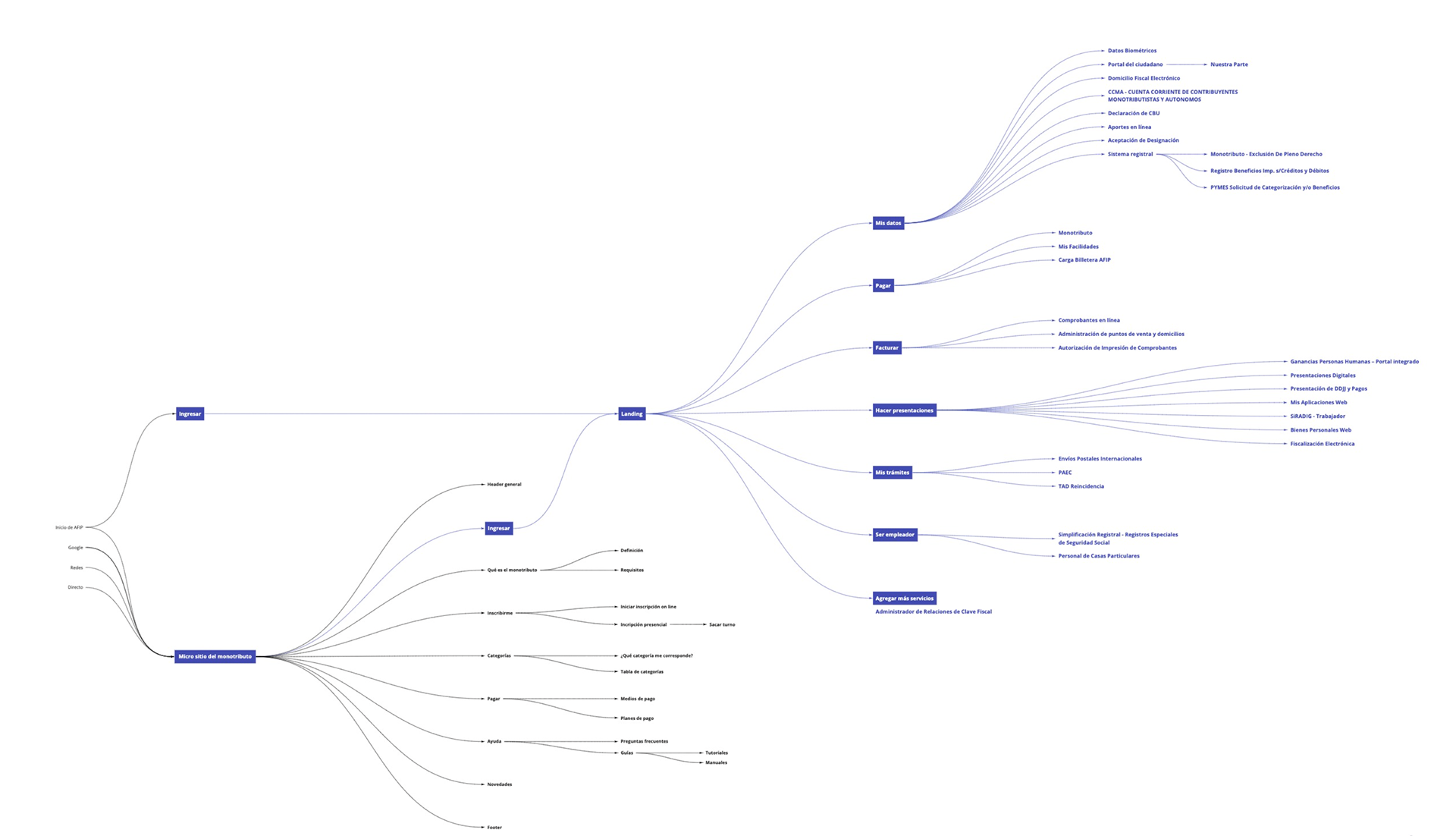
Final Information architecture diagram
Outcomes
The redesign addressed one of the biggest user pain points—navigation confusion—by rerouting links and consolidating access points. For example, three separate “Tax Payment” portals were unified into a single flow.
Key wins:
- Faster Access: High-priority services became one-click paths from the homepage.
- Cross-Team Alignment: Legal, IT, and help desk teams adopted shared KPIs.
- Cost Efficiency: Achieved through information architecture refinements, not costly redevelopment.
- Cross-Team Alignment: Legal, IT, and help desk teams adopted shared KPIs.
- Cost Efficiency: Achieved through information architecture refinements, not costly redevelopment.
What I Learned
- Information Architecture is Power: A single diagram can dismantle bureaucratic inertia.
- Patience Pays Off: Securing stakeholder trust in agile methods took time but unlocked much needed collaboration.
- Government Can Innovate: Even legacy systems can evolve with user-centered prioritization.